Category Archives: Africa

An Apples-to-Apples Comparison of African Sovereign Debt

I’ve been meaning to do this for months now, and the FT’s Jonathan Wheatley has just done it for me. Herewith, a side-by-side comparison of 10-year African sovereign debt issues from the past 15 months:

Country Issue Date Tenor Size Yield at issue
Zambia Sep 2012 10 years $750 mm 5.625%
Rwanda Apr 2013 10 years $400 mm 6.875%
Nigeria July 2013 10 years $500 mm 6.625%
Ghana July 2013 10 years $750 mm 8.000%
Gabon Dec 2013 10 years $1.5 bn 6.375%

As Wheatley correctly points out, this is a Gabon story as much as it’s an Africa story. There are a lot of ways to slice this, the most immediate being yield differences. Wheatley:

Is Zambia, at 5.625 per cent (cheaper than Spain at the time), really in a different ball park from Ghana at 8 per cent? Yes and no. When Zambia came to market in September 2012, yields on US Treasuries were at their tightest and investors were scrambling for any deal that offered something better.

“There were opportunities to lock in great transactions,” says Samara. “But you still had to have a story to tell.”

Rwanda faced perhaps an even more inviting market, with investors getting so frustrated at low yields in the US they seemed willing to take almost any risk. Even in that environment, however, Rwanda had to pay a lot more than Zambia.

Nigeria and Ghana tell a similar tale of the post-tapering world: the decidedly less risk-on environment that followed comments in May by Ben Bernanke, chairman of the US Federal Reserve, suggesting the end of ultra-loose monetary policy was on the horizon. But Samara says that even in those more difficult circumstances, the right issuers have been able to get bonds away.

I would also point out the dramatic difference between these yields, and the indicative yields of their currencies at the beginning of this year, which I previously discussed here. Pasting those local currency yields into the above table gives us the following:


Country Issue Date Tenor Size Yield at issue Indicative FX yield as of Jan 2013
Zambia Sep 2012 10 years $750 mm 5.625% 9.80%
Rwanda Apr 2013 10 years $400 mm 6.875% 12.30%
Nigeria July 2013 10 years $500 mm 6.625% 14.40%
Ghana July 2013 10 years $750 mm 8.000% 22.90%
Gabon Dec 2013 10 years $1.5 bn 6.375% N/A


The debt yields are significantly lower than the FX yields reported in January (courtesy of Silk Invest). A lot has happened in the world this year to drive this divergence, but what this screams of more than anything to me is the benefit of borrowing dollars in the Eurobond market.

Put another way, let’s use the example of Nigeria, which is far and away the largest economy of any of these. In an ideal world, an economy like Nigeria should be able to draw a far larger issue size than $500 million, and denominated in naira, but if they did, they would be paying much more than 6.625%. And even in dollars, the $500 million ticket size indicates that appetite is still fairly limited, despite all the currency risk being shifted onto Nigeria (which, having some 90+% of its economy dependent on oil, is less burdensome than the task facing, say, Rwanda).

I’m all for developing local currency financing mechanisms, but what this all says to me is that there’s still a VERY long way to go.

The ongoing challenge of assessing Frontier Markets political risk

2013.12 Frontier Markets Political RiskI’m generalizing it, but frontier markets political risk is my main takeaway after reading through Clear Path Analysis’ just-released Investing in Frontier Markets 2013.

And if that doesn’t get you excited, don’t let that deter you from looking further as there’s a lot of other stuff in there that I’m totally glossing over.

Some highlights:

Asked what kind of investors are mostly interested in frontier markets and how they’re using the exposure, Yvonne Bakkum of FMO Investment Management had this to say:

“We are talking about a diversified African private equity proposition to U.S. institutional investors, and it strikes me that we hardly have to explain the Africa story to them. They seem very well aware of the fundamental attractiveness of Africa as an investment destination but, are still studying the best way to access that opportunity. What type of asset class, should they go through public markets or private equity and if so should they select funds themselves or use a fund of funds vehicle? These are the types of questions being asked but in most cases the interest still needs to translate into actual commitments. Some African institutions haven’t decided as to whether they should invest and there we see an interesting discrepancy between the investment professionals and their boards of trustees. Trustees tend to be more cautious and want to start with BRICs because they are the more advanced emerging markets or the ones closer to home, such as Latin America. This means that you don’t always get everybody aligned simultaneously.”

Oliver Bell, portfolio manager of Africa and Middle East strategy for T. Rowe Price wound up having a lot to say about East Africa, among which was this nugget on the key risks in investing in African markets:

“The key risk still remains around the politics and the economics but the two are quite strongly linked. The first risk is when you get a change of government. 50 of these countries have had elections in the last three years so we are no longer talking about despotic dictators – this has become a relatively democratic continent. The key risk is that if the opposition wins an election does power get handed over peacefully? We’ve just seen a transition of power in Kenya for example which was peaceful but five years ago the election transition was very brutal. The more times you go through the peaceful transition, the more entrenched the democracy becomes. In Ghana we’ve seen the handover of power peacefully a few times so you get the sense that democracy is now deeply rooted in their society.

Related to the politics is the economic fallout that can occur in the run up to elections, because you tend to find that the incumbents spend aggressively to ingratiate themselves with the electorate. The targets go out of the window leading to a larger fiscal deficit, which can lead to currency weakness and hence inflation. This knock-on effect usually corrects itself the year after an election but it remains one of those things that you need to be very aware of when investing in Africa. One other risk at the stock level that we assess, when considering an investment in a company, is whether there are any political connections that the company is benefitting from, as this is not sustainable in the long term, given that the politics can change quickly.”

And finally, Richard Fox, Fitch’s Head of Middle East and Africa Sovereigns, had this to say about MENA political risk:

“Political risk is a fact of life but it varies from country to country. And it doesn’t necessarily mean a country is off limits to investors. Going back to where we started, the World Bank Governance Indicators would put a country like Nigeria or Lebanon very low down on the political risk spectrum. Nevertheless, these countries have a track record of foreign investment receiving very good returns. Just because political risk is high doesn’t mean that people will not put their money there…

… You can have volatile political developments but this does not mean that they automatically affect financial markets. Despite the political ups and downs of Lebanon, including war, there has never been a default and people are allowed to withdraw their money freely which has worked very much in Lebanon’s favour. Environments can be very risky but if you have investors aware of and happy to take those risks then it isn’t really an issue. In most cases, risks can be priced.”

Frontier Markets Opportunities and Risks, Bloomberg Edition

As part of last month’s Bloomberg Dealmakers Summit in London, the following roundtable took place, featuring Timur Issatayev of Verny Capital, Parag Saxena of New Silk Route LLC and Danladi Verheijen of Verod Capital Management. It’s 22 minutes and all worth it, but if you want the single most profound statement for my time, fast-forward to 15:10, when Parag Saxena has the following to say when asked about investment risks in South Asia:

“If you stay away from purely government-granted things you can probably do all right but sometimes that is where the opportunity is so it’s hard. To me the big surprise that I learned in India, having been in the investment business for 31 years and thinking that I have made already most of the mistakes that I was going to make in my investment life, the one that surprised me in India, and I know it’s true in Pakistan and Bangladesh too, is the lack of talent. So when I invest in the U.S., which I continue to do, I know that even for a pretty tough to fill job, in 120 days to 180 days I can fill almost any job. And so typically now at my age, I get resumes from my friends’ children. I used to get them from my friends at one point and now I get them from my friends’ children. And in the US I think it’s going to be hard to actually place them because there is so much talent available for a limited number of jobs. In India, I find myself grabbing every resume because I can hire baristas for somebody that wants a summer internship job, we have a restaurant company and cellular tower company and we need CEOs, so I can hire CEOs for those companies, and everything in between. So the biggest surprise to me, and the opportunity, is training for lower level jobs. And that’s a real unexpected risk, because time is the enemy of internal rate of return and if it’s going to take you more time to fill these slots and you can’t get stuff done, you have a real problem.”

Here’s the video in full:

Chart of the Day : Triple Threat for Emerging Markets

Apologies to everyone for the radio silence, but I’ve been occupied with an ongoing project in Peru the past few months. In the meantime, Morgan Stanley just published this chart via Barron’s:

2013.08.19.Emerging Markets Triple Threat

Chart of the Day: The World as 100 People

From Jack Hagley:

World-as-100-People_3


Charts Of The Day: Economic Potential In MENA

The most recent Milken Global Conference in Los Angeles featured a panel entitled, “Two, Three, Many Middle Easts: A Region’s Economic Prospects”, whose commentary is really only for the hard core MENA geeks, but I thought these charts were worth drawing attention to:

This one was the leader, showing average real GDP per capita from 1980 to 2000:

MENA Economic Development Variation 1

Here we have slides showing variation in GDP per capita across the Middle East and North Africa since 2001. Notice the y-axis scale difference between the Gulf states in the rightmost chart versus North Africa and “core” Middle East:

MENA Economic Development Variation 2

An approximate comparison of just how miniscule FDI flows to the region relative to the world:

MENA Economic Development Variation 3

Of the FDI that does go to the region, we shouldn’t be surprised to find more of it going to the oil producers than to the non-oil producers:

MENA Economic Development Variation 4

And yet expected GDP growth for the coming few years is expected to be mostly uniform:

MENA Economic Development Variation 5

Finally, intra-regional FDI against total FDI to the region:

MENA Economic Development Variation 6

The link to the full hour panel discussion is here and embedded below. If MENA development is your gig, I guarantee there’s something in there for everyone, from diplomats to venture capitalists and anyone in between. For my time, by far the best bang for the buck commentary comes from Chris Schroeder, who starts speaking at approximately minute 36. This man talks way too fast for me to transcribe or bother quoting any of it, but suffice it to say he depicts in words far more illustrious than any of these charts the economic potential the Arab World possesses.

Chart of the Day: Economic Growth vs Well-Being in Africa

I haven’t read the report yet and I’m not even sure I buy the premise, but this chart format is interesting, isn’t it?

Economic growth vs well being

Sourced from the Economist, on a recent Boston Consulting Group study entitled, “Strategies for Improving Well-being in Sub-Saharan Africa”.

How Much More Can Emerging Markets Debt Grow?

EM versus US High Yield Bonds riskLondon-based Clear Path Analysis has an excellent report detailing investment considerations for Emerging Markets debt and FX investing. So good, actually, that it’s forcing me to second-guess my previously held view that Emerging Markets debt is in a bubble approaching crisis proportions. It’s a long-ish report (32 pages) and it’s all important, so let’s get straight to some of the notable commentary they’ve put together. I think these quotes really speak for themselves.

Gregoire Haenni, Chief Investment Officer, CERN Pension Fund, on why Asia has and will continue leading EMs:

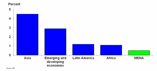
One of the main reasons why investors are beginning to allocate into EM is because of the Asian sovereign credit re-rating trend. Asian sovereign credit fundamentals have generally been on the up for the last six years which is in contrast to other developed countries. The fiscal discipline and underlying economy growth has capped government debt to GDP without exceptions and trade surpluses over the past decade have resulted in a build up of foreign exchange reserves.
Continue reading

Chart of the Day: Frontier Markets Correlations, Round 2

S&P Capital IQ slipped this press release out last week, which I’m glad I followed up on since it led me to the following correlation chart:

Frontier Markets Correlation vs Major Indices

Equally important, this comment which came alongside it:

From an asset allocation perspective, one of the biggest positive differentiators of frontier market equities is their relatively low correlation with both developed and emerging market equities as well as commodities (see table 2). The asset class’ ability to “zig” when others “zag” is a function of its aforementioned limited integration into the global economy and its more domestically driven fundamentals, in our view.

Continue reading

Charts of the Day: The Future Of Emerging And Frontier Markets

CarnacTheMagnificentThanks to Ernst & Young, I’ve got my retirement destination all picked out: Turkey.

Because, you see, in 2040, when I’m 67 years old, forget the BRICs or Mexico or Dubai or South-South anything; Turkey’s gonna be an export boomtown. Or at least that’s one of the forecasts E&Y is touting in its new Rapid Growth Markets forecast. And if, come 2040, I’m not rolling G-style through the souks of Istanbul, I’m definitely suing the crap out of the 2040 incarnation of Ernst & Young, which by then might be better known as ErnstPWCDeloitte-Slim/Gates LLC dot unit D sector.

In all fairness E&Y does a dependable job of summarizing the main economic characteristics of developing markets for those who don’t plug into this stuff every day.

And they also have a nifty online interactive tool you can play with here.

For the rest of us…the thing is I really just have a hard time taking seriously any forecast that goes out to 2040. But let’s try anyway. According to the charts, those of us lucky enough to still be alive in 2040, assuming there’s still a human race by then, should probably be doing something with exports. But definitely not anything between the Eurozone and the US:

Continue reading

Making Sense Of Angola Stock Exchange Plans

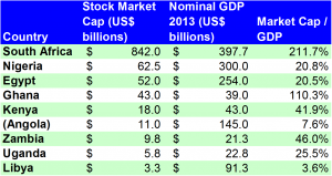
Africa Stock Market Cap FiguresBloomberg had a story out late last week about plans for an Angola Stock Exchange, entitled, “Angola Plans 6th-Biggest Africa Bourse With Value at 10% of GDP”. Since we (and by we, I mean you and me, in an apparently small minority) are resolved to have a realistic approach in discussing economic prospects anywhere, here are the main points of interest from the article once we strip away all the spin and optimism:

  • Angola, Africa’s second-biggest oil producer, expects its stock exchange to have a market value of 10 percent of gross domestic product within 18 months of its startup, making it at least the continent’s sixth biggest.
  • The capitalization of the exchange, set to start in 2015, would be a minimum of $11 billion based on last year’s output of $114 billion.
  • The Angolan government is forecasting economic growth of 7.1 percent this year, down from 7.4 percent in 2012.
  • A secondary bond market will start this year to help develop a yield curve.
  • South Africa’s bourse is the continent’s largest at $842 billion, more than double its GDP.
  • Angola ranks 157th out of 176 countries on Transparency International’s 2012 Corruption Perceptions Index.

The investment bank Imara just put together this brief which summarizes some key data points for other stock markets in Africa. There’s some good trading info in there but missing is any indication of market capitalization figures. I should add that this isn’t Imara’s fault necessarily as this data is generally pretty hard to come by.

The thing is, this isn’t the first time Angola has made efforts at opening a stock exchange. In December 2007, allAfrica.com ran a story entitled, “Angola: Stock Exchange Opens in 2008”, but I definitely remember hearing about this before then, though not as far back as 2003, which is when this article dates the beginning of the process.

In any event, here’s a more “recent” take on the Angola stock exchange prediction, from How We Made It In Africa in 2010. Apparently, Angola’s planned exchange was then expected to be the third largest in Africa. Particularly striking from the 2010 article was this little snippet:
Continue reading

Map Of The Day: Global Shipping Routes

Thanks to CNI Group for this:

2013.04.16.Global Shipping Routes

I guess what strikes me the most about this map is the huge blank spaces among the world’s global shipping routes: the Bay of Bengal, southern Australia, the west coast of South America, and pretty much all of sub-Saharan Africa that isn’t connected to either South Africa or the Gulf of Guinea. Of these, Australia at least has a viable road network. Relative to the entirety of the world, these don’t look like large spaces, but the increased costs for closing these gaps via land are not insignificant.

Another thing that comes to mind here is imagining how the shifts in shipping patterns may have happened over the centuries. Never mind the obvious growth in gross number of journeys; what I’m thinking of here is the opening up of new routes.

I’m not a shipping person, but I try to be as much of a history person as I can. Off the top of my head, I would venture that China’s periodic bouts with isolationism over the centuries have had material effects on the Asia routes, the most recent probably being a massive dropoff during the 1950s through sometime in the 1970s as China re-opened and Japan started coming online. And transatlantic development from the Industrial Revolution forward has kind of been done to death.

There’s also this book, which I’ve yet to read but has been on my to-do list since it came out. I suppose where this all leads is, what’s the future of this map? More specifically, how much of south-south trade development will any of us live to see?

A Diplomatic Way Of Saying A BRICS Development Bank Is A Stupid Idea

Dani Rodrik has this in Project Syndicate today:

It can be cause only for celebration that the world’s largest developing economies are regularly talking to each other and establishing common initiatives. Nonetheless, it is disappointing that they have chosen to focus on infrastructure finance as their first major area of collaboration.

This approach represents a 1950’s view of economic development, which has long been superseded by a more variegated perspective that recognizes a multiplicity of constraints – everything from poor governance to market failures – of varying importance in different countries. One might even say that today’s global economy suffers from too much, rather than too little, cross-border finance.

What the world needs from the BRICS is not another development bank, but greater leadership on today’s great global issues. The BRICS countries are home to around half of the world’s population and the bulk of unexploited economic potential. If the international community fails to confront its most serious challenges – from the need for a sound global economic architecture to addressing climate change – they are the ones that will pay the highest price.

Yet these countries have so far played a rather unimaginative and timid role in international forums such as the G-20 or the World Trade Organization. When they have asserted themselves, it has been largely in pursuit of narrow national interests. Do they really have nothing new to offer?

Read the rest here.

Everything You Know About Africa Is Wrong

Morten Jerven, economic historian of Simon Fraser University in Vancouver, has me hooked just with this single comment:

The demand for numbers is overwhelming. The data will be created, invented or otherwise imputed to fill the gap. When the data basis is meager and the aggregates rely on a lot of guessing and assumptions the statisticians have little defense and are vulnerable to pressure. This is not only a matter of costly waste of donor money. Discrepancies such as those found here can be vital differences in countries where large parts of the populations are living in, or are close to living in, absolute poverty.

The main lesson is that numbers do inform scholarly conclusions, impact donor decisions and inform policy choice. In most cases data users do not know or choose to ignore that they are being misled by development statistics.

Yes, live long enough and you will indeed see CNN not just paying attention to Africa, but actually getting it right.

And this is actually not just about Africa; to varying degrees it’s about economics and finance across the developing world. What differentiates the reliability of data in one market over another depends in large part on the skillfulness of the technocrats and p.r. spinmeisters in charge.

Chart Of The Day: Food & Agriculture Demand And Supply

What this screams is the urgency of leveraging Africa’s arable land potential. I wonder how Africa would stack up against the righthand chart:

2013.04.03.Food-Agriculture demand supply

From @CamboRobert.

What The BRICS Really Have In Common

2013.03.28.BRICS as The_Breakfast_ClubSometimes news editors exercise such brain-dead judgment that it’s a wonder journalism as a practice even survives.

That sentence was one of a few I conjured up as a possible lead-off thought. Well, technically, it was the only sentence, since the rest are thoughts posed as questions. Here they are:

Is the BRICS Durban conference officially the acronym’s 14th minute of fame?

When will the country grouping of France, Uganda, Chad, Kenya, Oman, Fiji and Finland finally supplant the BRICS as the political economy cadre du jour? What about Bulgaria, Uganda, Lithuania, Latvia, Spain, Haiti, Italy and Thailand?

2013.03.28.bric_summit_durbanDoes anyone honestly still believe in the BRICS as an investment theme?

Am I the only one seeing that Brazil, Russia, India, China and South Africa may actually have less in common than a brain, an athlete, a basket case, a princess and a criminal?

What drives this apparently human need to shrink everything down into bite-sized archetypal infonuggets?

Continue reading

A Dissection Of Market Manipulation In The Diamond Industry

Priceonomics put up a stunning take last week on the market mechanics of diamonds which spurred a lot of reactions. Worth reading in full, and here are some excerpts to give you an idea:

“Americans exchange diamond rings as part of the engagement process, because in 1938 De Beers decided that they would like us to. Prior to a stunningly successful marketing campaign 1938, Americans occasionally exchanged engagement rings, but wasn’t a pervasive occurrence. Not only is the demand for diamonds a marketing invention, but diamonds aren’t actually that rare. Only by carefully restricting the supply has De Beers kept the price of a diamond high.”

And this:

“In finance, there is concept called intrinsic value. An asset’s value is essentially driven by the (discounted) value of the future cash that asset will generate…A diamond is a depreciating asset masquerading as an investment. There is a common misconception that jewelry and precious metals are assets that can store value, appreciate, and hedge against inflation. That’s not wholly untrue.

Gold and silver are commodities that can be purchased on financial markets. They can appreciate and hold value in times of inflation. You can even hoard gold under your bed and buy gold coins and bullion (albeit at a ~10% premium to market rates). If you want to hoard gold jewelry however, there is typically a 100-400% retail markup so that’s probably not a wise investment.

But with that caveat in mind, the market for gold is fairly liquid and gold is fungible - you can trade one large piece of gold for ten smalls ones like you can a ten dollar bill for a ten one dollar bills. These characteristics make it a feasible potential investment.

Diamonds, however, are not an investment. The market for them is neither liquid nor are they fungible.”

And this:

“We covet diamonds in America for a simple reason: the company that stands to profit from diamond sales decided that we should. De Beers’ marketing campaign single handedly made diamond rings the measure of one’s success in America. Despite its complete lack of inherent value, the company manufactured an image of diamonds as a status symbol. And to keep the price of diamonds high, despite the abundance of new diamond finds, De Beers executed the most effective monopoly of the 20th century.”

Read the rest here.

Chart of the Day: Sub-Saharan Africa’s Mobile Phone Market

Lots of room to run here. What this doesn’t give us a clear view of though is undersubscription relative to absolute market size. Nigeria would obviously be the winner on that front.

2013.03.18.Sub-Saharan Africa Mobile

How Oil Divides The Economies Of Africa Into Winners And Losers

I can’t get this article from the FT’s William Wallis out of my head. The headline is “Currencies pressed by trade imbalances” but this really only captures a small slice of the picture. Check it out:

With import demand outstripping export growth in some of the continent’s fastest expanding economies, rising trade imbalances are putting pressure on currencies. African and international investors hedge against this by spreading risk – one factor that is driving African banks and businesses across borders.

But even an expansive footprint is not always enough. MTN, the continent’s leading telecoms provider with a presence in 21 African countries, announced that currency swings had weighed heavily on its earnings.

More broadly says Razia Khan, head of Africa research at Standard Chartered Bank, widening current account deficits are the result of an investment and consumption boom, new resource exploration activity and “the scaling up of output”. Ghana fits into this category. It is also on the risk radar this year as heavy investment in oil and gas infrastructure continues, with only modest increases forecast for oil output.

A weak currency does not help those African countries with limited capacity to ramp up exports in response. Kenya cannot for example suddenly double tea production. So, it is forced to defend its currency to avert importing inflation.

Loose monetary policy in major developed economies has driven a rush of short-term funds into African markets. David Cowan, Africa economist at Citibank, says the way in which central banks defend their currencies and the margins that foreign investors earn will be one determining factor in how long the appetite endures.

I don’t disagree with any of this but would point out that this is all just the tip of the iceberg and there are a lot of ways to slice this.

One is that just six of Africa’s 53 countries account for two-thirds of the entirety of Africa’s $2.0 trillion economy. In descending order of nominal GDP: South Africa, Nigeria, Egypt, Algeria, Angola and Morocco. I think a pie chart best demonstrates this relationship:

2013.03.20.Africa 2013 GDP composition

Another is to think about how much of Africa’s total economy is driven by oil exports. Let’s try the following table to demonstrate this:

Continue reading

InfoGraph of the Day: Chinese Companies and Risk in Africa

This is really impressive and makes me really rethink my previous notions of a political risk framework, particularly in the context of Africa. No more preface necessary:

2013.03.14.China risk in Africa

Sourced from Africa-Asia Confidential.